12000 - Cappuccino Brown
 IvanWuPI//Getty Images
“Beige is a tried-and-true favorite, but in the early 2000s, there was an urge to spice it up a bit,” says Noval. This cappuccino brown shade is built on the beige foundation, but it also brings a modern spin to an old staple—which is why so many people gravitated toward it.
22001 - Glistening Pearl
 phototropic//Getty Images
“Kitchens in the 2000s embraced a more natural, sophisticated aesthetic, moving away from the deep, bold tones of the 1990s to softer, warmer shades,” says interior designer Liz Williams, founder of Liz Williams Interiors. By using gloss on regular white paint, designers at the time created a glistening pearl shade that kept things elegant and sparkling.
RELATED: 10 Best Cabinet Paints, Tested by Experts
Advertisement - Continue Reading Below
32002 - Linen White
 Kanok Sulaiman//Getty Images
According to interior designer Leigh Kirby, founder of New York City-based interior design firm Weatherleigh Interiors, soft white was a staple this year, with designers going for a clean look that remained uncluttered. “Linen white refers to a softer white that pairs well with sophisticated countertops like granite,” she says. The focus was on the stone, so the kitchen needed a lighter base to let it stand out.
42003 - Azure Blue
 Gladiathor//Getty Images
“Azure blue is light and breezy, reminding us of joyful optimism and crisp ocean waves,” says Noval. “This serene color fits perfectly with the neutral theme of the decade, but it wasn’t dull.” Soothing themes were the central aesthetic this year, she adds.
Advertisement - Continue Reading Below
52004 - Cherry Red
 Gladiathor//Getty Images
After the tranquil tones in the first half of the decade, people began to look at pops of color in their kitchens. “Cherry red was huge this year, especially since it added a playful tone to spaces, and allowed for the kitchen to become a statement in the home,” says Noval.
RELATED: The Biggest Paint Color Trends of 2025, According to Design Pros
62005 - Cool Turquoise
 Andreas von Einsiedel//Getty Images
According to Kirby, turquoise was the perfect mix between tranquility and colorful, which is why it was so popular in 2005. “It merged the two desires of the decade effortlessly, and it had a calming quality to it,” she says.
Advertisement - Continue Reading Below
72006 - Clay Orange
 Yury Gubin//Getty Images
“Bold orange was the equivalent of rebellion—and it was also the time when millennials began to come of age,” says Noval. This allowed for brighter colors than had ever been seen in kitchens before, and this extra daring orange was a reflection of that.
82007 - Sky Blue
 Gladiathor//Getty Images
“Pastels shone at the end of the decade, and light blue was incredibly popular this year,” says Kirby. “This shade created an open, fresh feel, and made kitchens appear more spacious, especially in popular open floor plans.”
Advertisement - Continue Reading Below
92008 - Light Pink
 BongkarnThanyakij//Getty Images
In that same pastel vein, light pink was added to the mix in 2008, which lent a tranquil feel to the home. “Pink suddenly became a very popular shade for kitchens, especially as people realized it was neutral, yet sunny enough for added warmth,” adds Kirby.
102009 - Chic Violet
 ismagilov//Getty Images
“Violet was very popular at the end of the decade, as people leaned into muted tones for added sophistication,” says Noval. “Earlier, these colors were simply accents, but now, they were statement-making all on their own.”
Advertisement - Continue Reading Below
112010 - Complex Grey
 SolStock//Getty Images
“Grey was a new way to bring in dark, moody hues into a kitchen without going overboard,” says Noval. “White finishes made sure there was still a brightness to the room, but the focus was definitely on duskier looks.”
122011 - Millennial Pink
 izusek//Getty Images
Is anyone really surprised this was the color of 2011? “Millennial pink was everywhere, so it naturally made its way into our homes,” says Noval. It was the color that could go equally well with soft whites as it could with stronger hues like navy, so it was versatile for every home.
Advertisement - Continue Reading Below
132012 - Sunny Yellow
 Jacek Kadaj//Getty Images
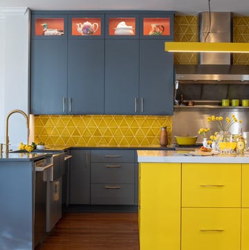
“Bold tones took center stage this year, and yellow was the standout,” says Noval. “There was a desire for brightness in the home, and often in an overwhelming way.” Yellow represented a fresh feel and the desire for new, along with a renewed sense of using the kitchen as an entertaining space.
142013 - Striking Off White
 John keeble//Getty Images
People were over all the color this year, but instead of returning to snowflake white, they went for off-white instead. “Crisp whites and off-whites dominated the 2010s kitchen color scheme," says Williams. "These shades created an open, fresh feel, and made kitchens appear more spacious, especially in popular open floor plans,” she adds.
Advertisement - Continue Reading Below
152014 - Chocolate Brown
 holub3dmax//Getty Images
“Warm and inviting, chocolate brown lent a timeless look to a kitchen,” says Kirby. “A return to the all-wood log cabin feel of the 1700s, it provided a nature-inspired vibe that people gravitated toward at the time.”
162015 - Forest Green
 piranka//Getty Images
“This year, forest greens paired beautifully with deep browns to create soothing spaces,” says Noval. “It was all about adding serenity in unique ways, with darker shades allowing for contrasts that weren’t seen in interior kitchen design before.”
RELATED: Popular Bathroom Paint Colors to Match Any Design Style
Advertisement - Continue Reading Below
172016 - Basic Beige
 onurdongel//Getty Images
“While it can be seen as boring, beige was a staple in 2016 due to the resurgence of the boho chic look,” says Kirby. Paired with accents like rattan chairs and textured quilts, beige was anything but boring. In fact, it was just what those accessories needed to feel chic in their own right.
182017 - Navy Blue
 in4mal//Getty Images
“Striking navy blue was huge this year, often paired with white cabinets for a two-tone vibe,” says Kirby. It was a more subtle take on jewel tones, and it added a brightness that isn’t normally seen with stronger blacks or purples.
Advertisement - Continue Reading Below
192018 - Daring Black
 JohnnyGreig//Getty Images
“After the navy obsession of the year prior, people began to play with darker tones like black to really hit the trend home,” says Kirby. “It was all about cozying up to those richer hues and letting them steal the show.”
202019 - Vibrant Teal
 Bulgac//Getty Images
“Vibrant tones were huge in 2019, right before the pandemic hit,” says Lina Galvoa, co-founder of interior design firm Curated Nest. “Teal was a major hit, especially because it mimicked a retro vibe, and added the cool factor to a kitchen.”

Nikhita Mahtani is an NYC-based freelance writer with six years of experience specializing in design and wellness. She primarily writes home tours, service pieces, SEO stories, and features, offering readers practical tips to personalize current trends. Nikhita holds a master's degree in magazine journalism from New York University, and her work has appeared in publications such as Veranda, SELF, Allure, ELLE Decor, Domino, and Dwell.
Advertisement - Continue Reading Below
Readers Also Read
Advertisement - Continue Reading Below
Advertisement - Continue Reading Below


