Some paint colors have a special way of exuding a vintage flair, and regardless of where you use them — a dining room, bedroom, living room — they feel relevant year after year. They add more charm to older properties and can even imbue newer homes with a sense of character.
That's why we decided to turn to the pros to find out the top vintage paint colors that are worth keeping on your radar for a home refresh. From rich green tones to earthy neutrals, keep reading for designers' favorites.
Green Tones
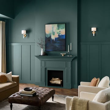
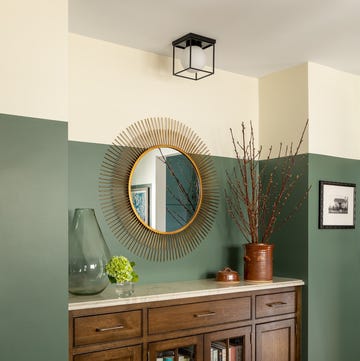
Lean into the beauty of nature with shades of green. You can go moody (think forest green) or opt for olive hues for a vintage touch. "Green has always been a staple of historic interiors," says designer Lauren Saab of Saab Studios. "It echoes the natural world, flatters almost every material and never feels trend driven."
A few of Saab's go-to green paint colors include Benjamin Moore's Saybrook Sage, "a quiet, olive-toned green that brings soft contrast without feeling trendy. It has the kind of softened depth you often see in historic interiors, especially when used on cabinetry or millwork." There's also Sherwin-Williams' Rosemary, which the designer says is versatile enough to elevate spaces like pantries and home offices. "It's a deep, moody green with an old-world richness that instantly anchors a space. It adds weight and dimension without overpowering the room."
For designer Heather Kirk of Kirk Riley Design, forest and Kelly green are worth considering and work well with wood tones as well as whites and cream colors. "They were huge hits in the 80s, and they're back — just don't pair it with mauve," Kirk says. She also suggests the "fresh and crisp" pairing of dark green with light blue.
If you're up for color-drenching a room's walls and ceiling, Suzanne Barrow of Barrow Interiors often turns to Farrow & Ball. "Farrow & Ball offers a range of paint colors inspired by vintage and rich historical palettes, and Green Smoke is an amazing, smoky color with a hint of blue that was popular in interiors during the late 19th century," Barrow says.
Deep Plums
These days, designers are embracing purple hues, too. Stick to rich tones to give rooms a feeling of warmth and luxury. Designer Susan Petrie specifically favors deep plums. "The color is a nod to an iconic 1970s palette and offers a vintage vibe that is moody and sophisticated," says Petrie, founder of Petrie Interior Designs. "It also creates a sense of depth that can be both dramatic and soothing at the same time."
Greige
Another designer favorite is greige — a blend of gray and beige. Designer Lina Galvao of Curated Nest Interiors points to Benjamin Moore's Pale Oak as an example, since it complements both warm and cool shades. "We love how it looks with vintage decor or traditional decor, providing a hint of color, but serving primarily as a supporting character for other tones in the room," Galvao says.
Blues
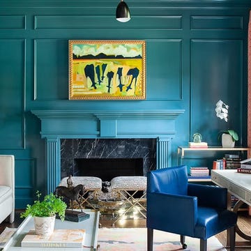
Calming blues are another no-fail option for an old-world vibe. "One of my favorite vintage-inspired shades is Oval Room Blue by Farrow & Ball (No. 85)," says designer Peggy Haddad, who finds the blue-green hue to be a great match for navy. "Oval Room Blue has depth without feeling heavy, with a subtly aged quality, thanks to its black undertones, that make it feel like it’s always been there. In fact, it’s named after the oval-shaped rooms of the late 18th century."
Saab is also drawn to Sherwin-Williams' Daphne and recommends it for breakfast nooks or just about any room that can benefit from a timeless feel. "It has a powdery, vintage softness that brings instant nostalgia in the best possible way,' she says. "It’s a muted blue with just enough gray to keep it subtle and serene."
Creams + Warm Whites
From Benjamin Moore's White Down to Farrow & Ball's Slipper Satin, Saab says shades of cream and warm white make a room feel inviting. "They lend warmth without weight and have long been used to brighten spaces without losing character."
She suggests pairing shades like Slipper Satin with oak floors and unlacquered brass. White Down, a warm white, is a go-to for creating classic setups. It has "a creamy base and a soft depth that keeps it from feeling flat or sterile," Saab says.
Warm Neutrals + Earth Tones
"Warm neutrals and earth tones draw from the materials that defined early interiors like clay walls, worn leather and raw wood," says Saab. "They bring a sense of permanence and patina, grounding any space in something that feels storied and lasting."
Think a muted rose-beige such as Sherwin-Williams Renwick Rose Beige, which Saab suggests for powder rooms, bedrooms or a library with low, ambient light. "It has a sepia undertone that instantly softens modern lines and adds a touch of age and elegance," Saab says.
And for home libraries and offices with traditional details, Saab goes for a Benjamin Moore Davenport Tan, a muted gray. "It's part of the brand’s Historical Color Collection and offers a deep, burnished brown that instantly adds depth and character to a space," she says.
Monique Valeris is the home design director for Good Housekeeping, where she oversees the brand's home decorating coverage across print and digital. Prior to joining GH in 2020, she was the digital editor at Elle Decor. In her current role, she explores everything from design trends and home tours to lifestyle product recommendations, including writing her monthly column, "What's in My Cart."


